01.9.2014 | By Mariana Dussan |
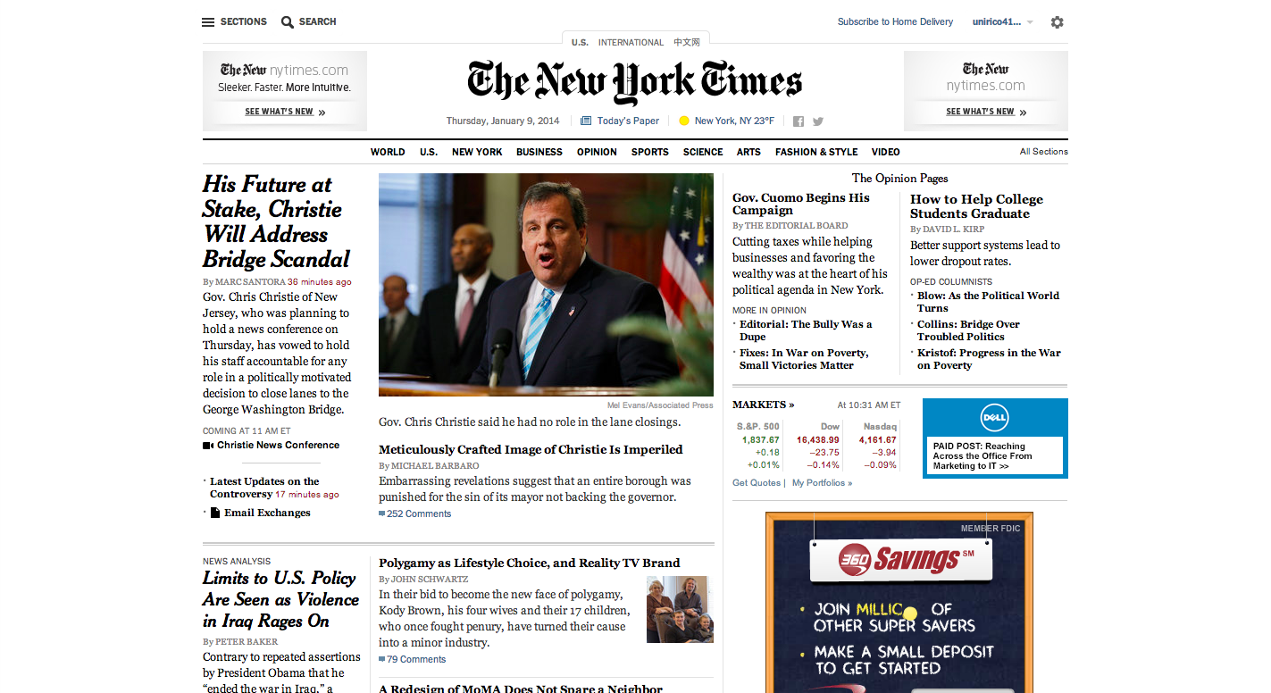
The New York Times has finally launched its newly redesigned website, but will it be enough to guarantee the company a future?
It’s no secret that in a time of social media, citizen journalists and fast paced news newspapers have suffered a harsh decline over the last few years with many companies having to close down or like the case of the NYT, increase focus on their digital platforms and minimize it on print in order to survive.
The last complete facelift the publication did was back in 2006 when not even the iPhone was out on the market.
Now with their latest redesign The Times’ goal is to attract more readers who are mobile device inclined since, according to CNN Money, about one third of its traffic comes from readers on smart phones and tablets.
“It was important that we created a responsive layout that enhances the presentation of our content on larger desktops down to tablets,” Denise Warren, executive vice president of the digital products and services group at The Times told CNN Money.
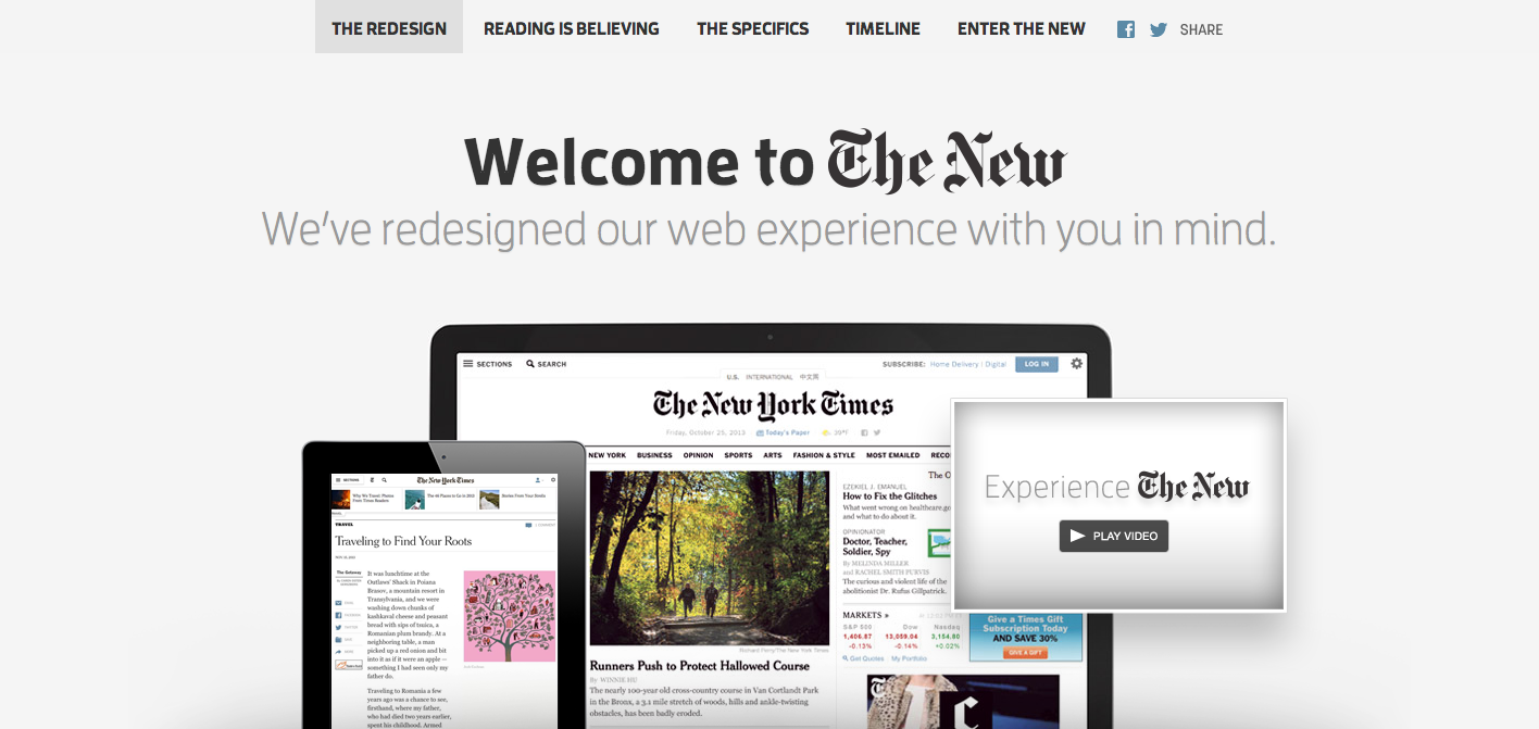
The publication has done a complete overhaul of the site changing its content management system and technology platform in order to make it easier for the site to keep an updated look. “We can continually iterate on the site and take advantages of the trends as we see them happening, rather than having to do a big unveil,” Warren told Fast Company.
Click the photo below and take a look at all the details of the redesign:
It’s definitely about time that one of the biggest and most respected publications crawled out of the past, but I’m not convinced they’ll succeed past 2014.
Yes the site is definitely more open and much easier to navigate, but doesn’t it look a bit too familiar? “The new NYTimes.com website seems eerily similar to something Apple would do,” adds Jack Rico, editor in chief of ShowBizCafe. “Everything from the ‘cleaner’ design, to the musical bed used, to the language used to promote the site, it is all Apple influenced. Actually, it looks like they took the iPad design and used it for the website.”
I think that this new layout would have been great sometime between 2006 and 2008 because during back then it would have been fresh and truly innovative. Yes, the back workings of the site might be brand new but the face remains the same just uncluttered, faster and with a few more buttons.
Today, social media is king when it comes to media, and millennials are the future. That means that a site must be willing to attract younger generations through condensed stories and more attractive visuals. Sure, the NYT caters to a more upscale reader concerned with quality journalism, but surely they could offer the same excellent content in a more attractive package.
USA Today is a prime example of this. Back in 2012 the publication did a complete do-over on both their site and newspaper and although I don’t quite love the print version, I truly believe that their digital platform is genius. The redesign is clean, but fun, and for a generation like mine that has grown up on television, video games, and social media sites it is immediately captivating. The NYT doing enlarged photos and videos is really nothing out of the ordinary and in a few years or maybe even less, sites that think like USA Today are bound to bury it.
We want to know what you think about the new redesign. Do you think they needed a change? Will you be visit it more now? How better is it really? Leave your comments below.


